
This is our final choice.
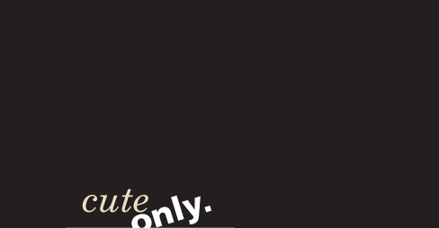
Why do we choose that?
- We find it glossy and stylish. By looking at it some of us even start thinking about Vogue, Yves Saint Laurent and million dollar cocktail parties. Some of us, not all, thank God.
- It delivers the clear statement. Cute only. Period.
- Thousands of web services have really nice but similar logos. We have something outstanding. It’s aligned to the bottom. It’s almost black and white. No rounded fonts. No icons.
Right now after writing this text I think that we’ve created a perfection. You must be hating our new logo at this point.